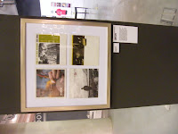
 Hip hop is not really my sort of thing, but I still appreciate the design behind it and the silly tracksuits so I went along anyway. Due to my lack of knowledge, I read a lot and can't remember much. I suppose the things we took for granted and thought were cool what seems a couple of years ago now just looks pathetic. From an analytical point of view, it was good to see how fashions had changed but disappointing to see the number of gendered music videos with scantily clad women dancing around in them, thinking to myself that it just got less and less about the music and more and more about image. The treatment of women in hip hop/rap scene is obviously a talking point and seems to be more accepted these days. Run DMC didn't need that image to sell records so why does Fifty Cent and the rest of em.
I found myself looking around the gallery from a designers point of view. Looking at stock and print and particularly typography. I think they did a nice job of the logo and info boards for the various eras. Looks like they had used a normal wall covering and then applied a vinyl cut sticker over the top. Some of the design of the early 90's left a lot to be desired but I'm sure that sort of stuff will come around again in the next 10 years.
Here are my photos from the exhibition.


Home Grown Exhibition @ The Urbis, Manchester
Posted:
Sunday, 10 January 2010 |
Posted by
Adam Townend
|
Subscribe to:
Post Comments (Atom)

0 comments:
Post a Comment