I am always wary of looking at websites for inspiration like DeviantART, and flickr groups just because you don't know who's designed them, what they have used to design them and if they are hitting the right audience, using the correct typography to get across their message and most importantly when designing for a magazine that they are using a grid system correctly.
The Behance Network seems to be a little different from the websites I mentioned above. The examples I have posted here do seem quite professional. The website itself promotes designers portfolio and seems to attract more professional work than somewhere like DeviantART. I trawled through the editorial section and found some really nice examples, and now I know more about grid systems I can break down examples and hazard a guess at how many columns were used, calculate the gutter and margins approximately and generally see what is and what is not working.
I have loads of examples that I have taken inspiration from for my own ideas and also looked at how space is used with a varying amount of copy on a page.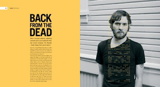 From strict 3 column grid layouts, with a varied head and foot margins
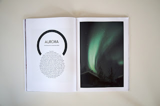 To freeflowing less structured text using thick margins and a single column style for less body copy
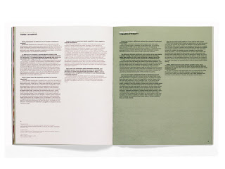
From neutral colours and 2 column grid with identical gutter and inner and outer margin widths To expressive colour, and incorporated imagery which overlaps pages to mask the centre fold.
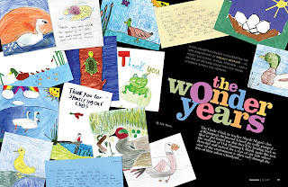 And finally more visually driven layouts with what looks like originated from a two column grid
and has been rotated 45 degrees for impact.
More examples...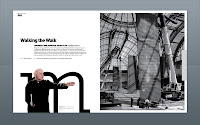
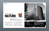


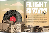

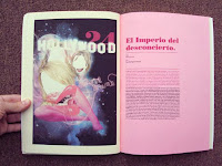
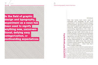
Magazine Layout Design: Behance Network
Posted:
Monday, 9 November 2009 |
Posted by
Adam Townend
|
Subscribe to:
Post Comments (Atom)

0 comments:
Post a Comment