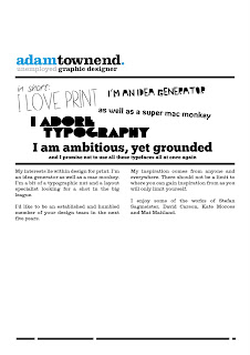
 These are the first drafts of a potential CV and portfolio. I wanted to keep the layout of both quite simple but also eye catching, hence the use of different typefaces in the centre of the CV. This is a short section where I enlisted all my qualities, as I know creatives are busy people. I wanted to some up my strengths in just a few words.
Portfolio examples.


0 comments:
Post a Comment